
ABC Movie Theater App

Client
ABC Theaters
Sector
Food & Drink, Entertainment
My Role
UX Designer
Project Time
4 months
Project Overview
The Product
ABC Theater group is a national movie theater chain that screens captivating feature films to millions of viewers. ABC Theaters focuses on providing seamless concession transactions and great customer service. We target avid movie-goers and busy folks who treat themselves to indulgent movie experiences.
The Problem
Long waits in concession lines shortly before movie start times are unpleasant and stressful for movie-goers, hurting customer experience and reducing their desire to purchase concessions in the future.
The Goal
Add a feature to the existing ABC Theater app that allows users to easily pre-order and pick up movie concessions before their screenings.
Understanding the User
User Research Summary
I led research efforts, which included crafting user storyboards, user journey maps, creating personas, and conducting competitive audits into both direct and indirect competitors, to gain insights into the users I’m designing for and their needs. A primary user group identified through research was the “busy adult” who doesn’t have time or patience to wait in concession lines for snacks ahead of their screenings.
This user group confirmed initial assumptions about ABC Theater customers, but research also revealed that time was not the only limiting factor preventing folks from ordering concessions. Other problems include the physical stress long lines can induce, as well as the frustration of waiting in long lines to order the same, recurring order.
User Pain Points
Wasted Time
Busy folks don’t have time to wait in long lines before their movies begin and are less likely to purchase snacks if they have to
Physical Stress
Long lines and wait times can induce physical stress, especially on those with pre-existing medical conditions
Recurring Orders
Users who regularly see movies are likely to order the same concessions, and become frustrated with long wait times
Persona

User Journey Map
Mapping Julia’s user journey revealed insights into the greatest problem areas and opportunities, which are highlighted in the user journey map below. Julia and all users will reduce their anxiety and physical stress, created by time constraints and standing for long periods of time, by submitting orders online, allowing users to easily pick up and their movie snacks. This research method was incredibly helpful in discovering new problem areas previously unnoticed in my research, including the physical pain factor, which presents an opportunity to improve the experience for all users.

Starting the Design
Paper Wireframes
I took the time to rapidly draft various iterations of the app to produce creative ways to address user needs. After drafting 5 versions of the app, I reviewed all iterations to select the elements I believed best suited this feature. In the below images, I starred the elements which stood out as elements I’d like to include in my first digital wireframe, including a call to action button along with a menu preview to incentivize pre-ordering. I also utilized the majority of the home screen to provide users with information about their upcoming screening as this app presents the dual purpose of ordering tickets/viewing tickets as well as pre-ordering snacks.
-
![]()
ITERATION 1
-
![]()
ITERATION 2
-
![]()
ITERATION 3
-
![]()
ITERATION 4
-
![]()
ITERATION 5
-
![]()
FINAL ITERATION WITH PREFERRED ELEMENTS


Digital Wireframes
As the initial design phase continued, I made sure to ground the screen designs in valuable feedback and findings from user research. An efficient and intuitive order flow was key to address in the designs in addition to featuring large, appetizing images of the food.

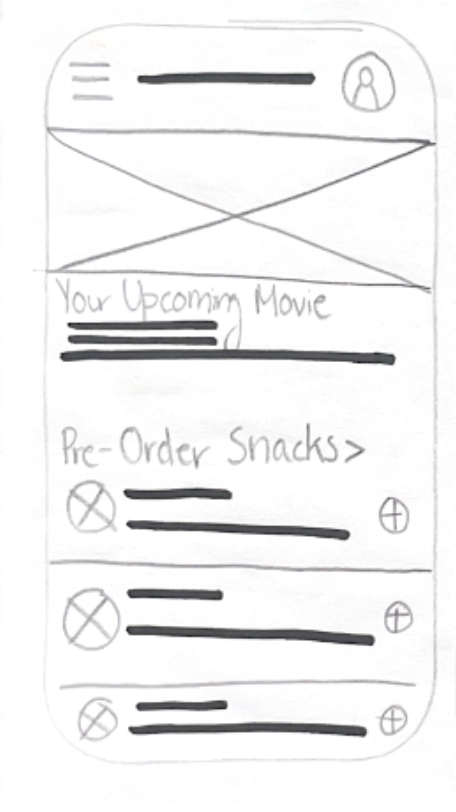
The pre-order button at the top of the screen makes it fast and easy for users who have already purchased movie tickets to order snacks for their screening
The preview of food items entices users and gives them a sense of what is available for pre-order

Order it Again section is large and eye catching to simplify the ordering process for those who tend to order the same concessions
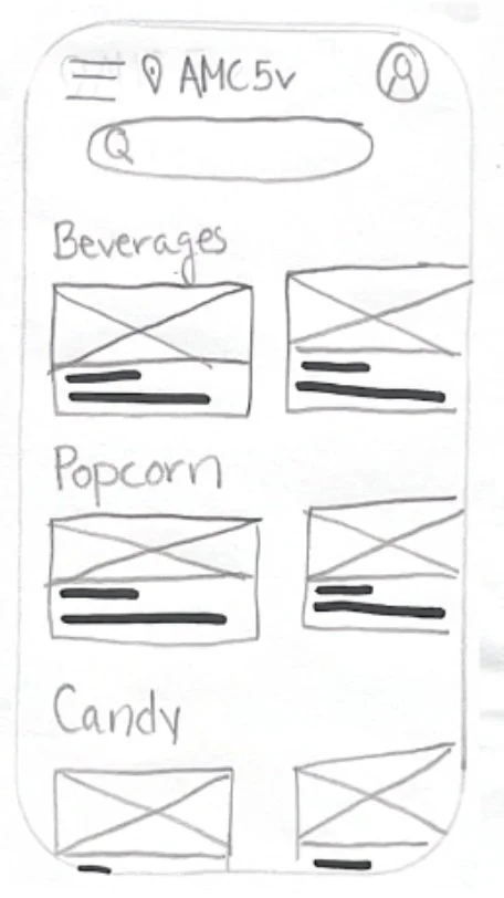
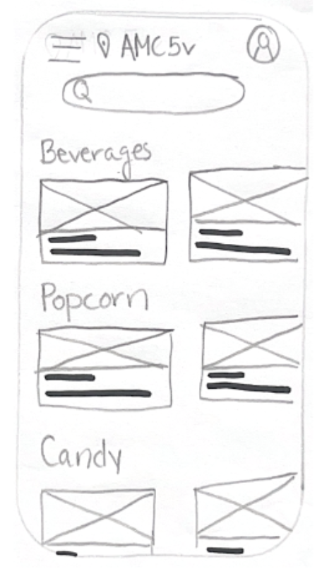
Food categories simplify the menu and allow users to easily find what they need
Low Fidelity Prototype
The low-fidelity prototype connected the primary user flow, which included pre-ordering concessions and scheduling pickup, so that the prototype could be tested by participants in a usability study.

Usability Study Findings
I conducted two rounds of usability studies, in which I guided 5 participants through both the low and high fidelity prototypes using open-ended, goal-oriented prompts, recorded via Loom. I carefully examined the results of each study and discovered useful findings, detailed below, which informed my iteration from wireframes to mockups as well as my refinement of the high fidelity prototype to the final version. These studies were immensely helpful in discovering more insights into the target user and how I can better address their needs and simplify the user experience.
Round 1 Findings
Key CTAs were difficult to find due to their location at the end of the scrollable screen
Users were confused by the purpose of the track and pickup order pages as well as the information that was included on these pages
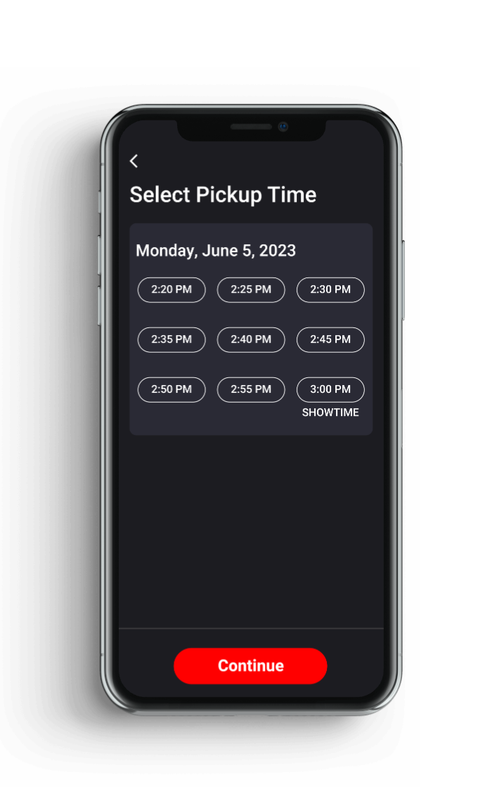
Users enjoyed the scheduling options included on the scheduling page
Round 2 Findings
Folks were confused by the font on the sign in page
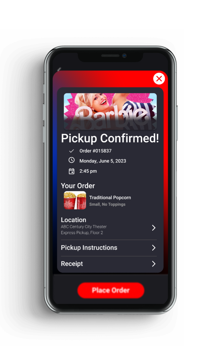
They felt they lost information regarding their orders at the confirmation page
They wished they could use a search function when reviewing the menu
Refining the Design
Mockups
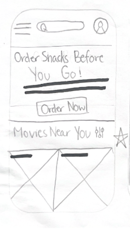
I found in the first usability study that users were confused by the menu preview included on the homepage, and were concerned about clicking on individual items as there was no explanation as to where and how they would pre-order concessions. In the high fidelity prototype, I opted for a large pre-order CTA button paired with educational copy that explains the pre-ordering process.

Before

After
The second usability study revealed users’ frustration with the lack of pricing/item information and their inability to search the menu. To improve the ordering experience, I added a search bar that allows users to easily search for their preferred food item. I also adjusted the design of the menu items to appear larger with pricing and item details listed throughout the user flow.

Before

After
The first usability study revealed users’ confusion with the order confirmation/track order pages, which provided users with regular updates on the status of their order. I discovered that the status updates were unnecessary for this particular feature, so I simplified the order confirmation page to include only the most pertinent information regarding their order. Also, the low fi version of the track order page was a separate page, which made users anxious they’d lose their order information if they closed the page. Now, this page is a collapsable overlay and is accessible on the homepage after order so users can easily refer to order information as they please.
The first usability study revealed users’ trouble finding the CTA buttons, which were hidden at the end of each scrollable page. In the final version of the product, I instead fixed the CTA buttons in the same visible location, and chose the color red to ensure the buttons were easily discovered on each page.

Before

After
Preview


High Fidelity Prototype
The final high-fidelity prototype presented simpler, more intuitive user flows for pre-ordering concessions. It also met user needs for transparency and simplicity.

View the ABC Theater high-fidelity prototype
Moving Forward
Takeaways
Impact
Not only were users satisfied that the app addressed their needs but were also enthusiastic to use this feature for future movie outings.
“I would definitely recommend this app because every time I go to a movie it’s like a 10-minute wait to order food! Pre-ordering through an app is so convenient and would make life a lot easier.”
What I learned
While designing the concessions feature for the ABC Theaters app, I learned that the first ideas for the app are just a starting point in the design journey. Usability studies offer a fresh perspective that influence each iteration of the design to better meet the user’s needs.
I also realized that sometimes, a simpler design in the best approach in designing. I originally included a tracking/pickup order status page but quickly realized that users likely would not want or need status updates on an order they scheduled to pick up. Though other food ordering apps include a status page, it proved unnecessary in this case, which is a great reason to always question your reasons for adding a feature that appears on other apps.
Next Steps
1.
Conduct another round of usability studies to validate whether the pain points users experienced have been effectively addressed
2.
Carry out more user research and another competitive analysis to determine any new areas or features that need to be addressed or added
Let’s Connect
Thank you for taking your time reviewing my work on the Glam Guides website! If you would like to see more or get in touch, my contact information is provided below.